PayPal
Like all great businesses, PayPal is continually driven to expand its range of consumer products. But when in-house resources can't support specialized business initiatives, the company turns to outside expertise. Our client, a specialist in developing branded consumer credit services, was selected to bring a PayPal-branded MasterCard to life.
M7 joined the PayPal project to create the card's digital experience, targeted at small businesses. Our deep fintech roots, and familiarity with regulatory standards, allowed us to hit the ground running. Developing a multi-site approach with API integration to MasterCard was a complex task- but also a perfect match for our experienced team.
Project Details
From The Ground Up
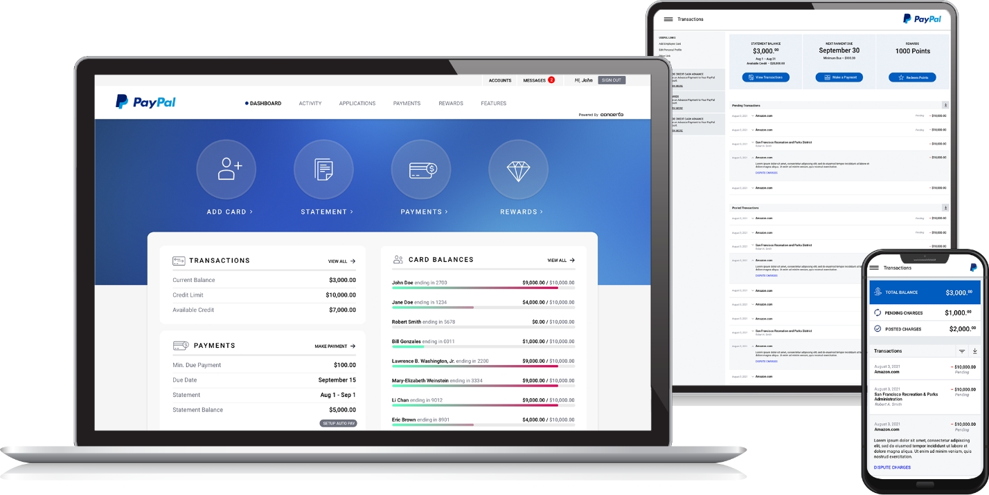
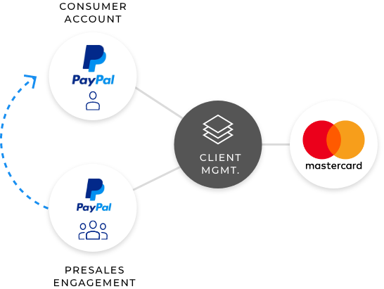
This project was an entirely new initiative for PayPal and our client. The funnel framework consisted of two PayPal-branded sites, managed by our client, that connect via API to Mastercard. Site #1 is designed to engage consumers and generate new member signups. Site #2 is a best-in-class account management app for members. After reviewing dozens of competing sites, we designed it to be more feature-rich and intuitive than many sites created by major players in the consumer credit market.
Infinite Branding
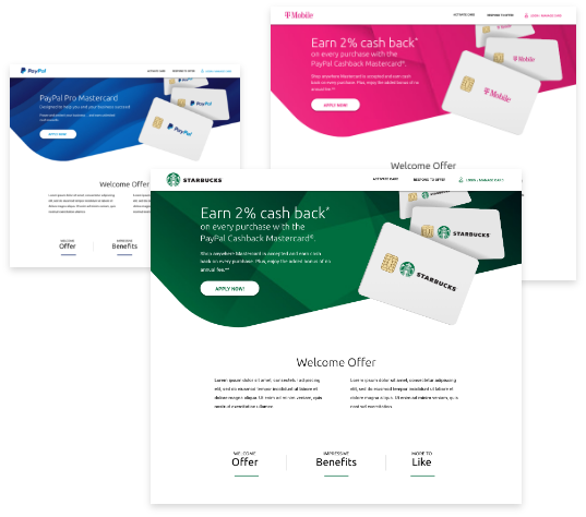
Although PayPal was the end-client for this project, the overall product vision was much bigger. The ultimate objective was to create a white-labeled product that could be quickly rebranded for future customers. Our simplified, but forward-thinking approach, allows rapid deployment with swap of just a few few images and CSS changes. The upshot is that a new client can be ready for launch with minimal involvement by creative teams.
Maximum Mobile
From the get-go, we were driven to design a full-featured mobile experience. Knowing that many competing services offer limited mobile feature-sets, we were adamant that every component be available to mobile users. Making payments, adding new accounts, and every other feature available on desktop is accessible on phones and tablets. Further, all components were specifically crafted for the mobile experience – not simply resized and slotted into available space.

ADA Compliance
From the get-go, we were driven to design a full-featured mobile experience. Knowing that many competing services offer limited mobile feature-sets, we were adamant that every component be available to mobile users. Making payments, adding new accounts, and every other feature available on desktop is accessible on phones and tablets. Further, all components were specifically crafted for the mobile experience – not simply resized and slotted into available space.
