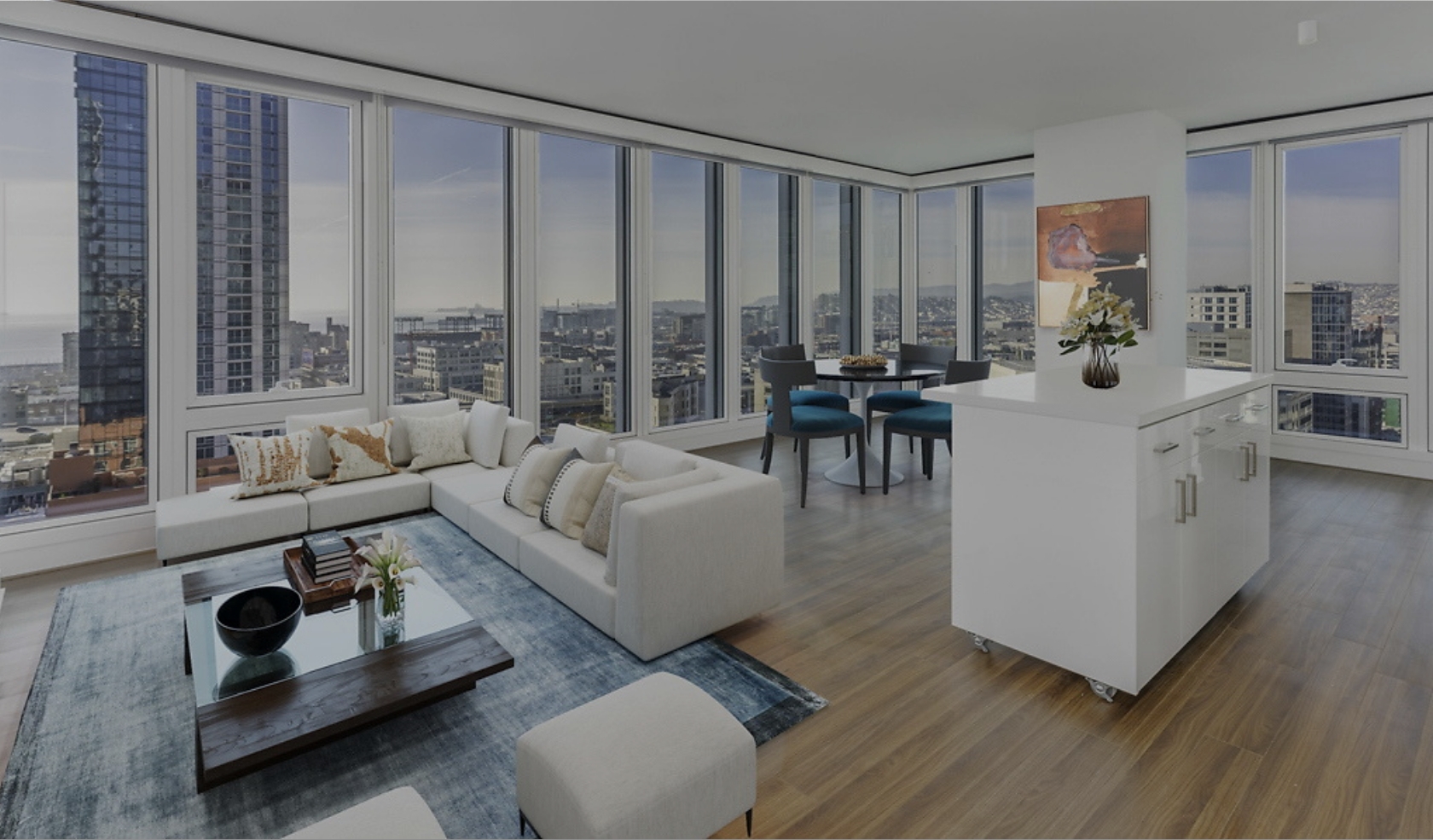
Essex Apartment Homes
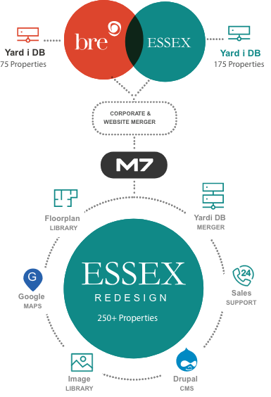
A large Real Estate Investment Trust (REIT) acquired our client, a smaller REIT with a portfolio of high-end apartment homes. The parent company wanted to quickly merge the two brands and launch a new site with all the properties consolidated. We were hired based on our close working relationship with our client the technical strength of their site.
Winning over the new client with our technical planning and expertise, we offered suggestions for improvement from years of working in the space and were still able to execute in a very tight time frame. The result is a site that elevates the design beyond the existing brands and delivers a best-in-class experience for the home seeker.
Project Details
A Completely New Infrastructure
The first step was to reconcile content and determine the content strategy for the new, digitaldestination. Marker Seven worked with the client to identify everything would be merged or replaced and reconciled more than 2,000 existing pages from both sites, determining a common terminology in the process. Once the infrastructure was established, we drew up a new sitemap and designed a user experience that implemented new features and offered more ways to search and explore.
We managed and implemented integrations with a client-managed database and two third-party Yardi databases to pull in floor plans, descriptions, images, pet policies, and amenities for over 500 properties.But we allowed content managers to override that data with content entered directly into the Content Management System (CMS) if needed. Building on a flexible, user-friendly CMS, the site gave the clientthe flexibility to maintain and manage their content in a way they did not have before.
A Seamless SEO Transition
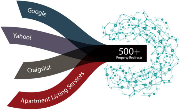
Hard earned search ranking and results could not be sacrificed in this transition. We fixed broken links and implemented redirects for more than 500 properties to ensure that referrals form Craigslist, Yahoo and apartment search sites found their way to the correct listings. We added tracking codes to contact forms on the community pages and to referral links to make sure the client could track exactly where all their traffic was coming from. Post launch, traffic and referrals remained steady and because we delivered an improved user experience, the new site is even better at converting search leads into leases.
Elevating the User Experience
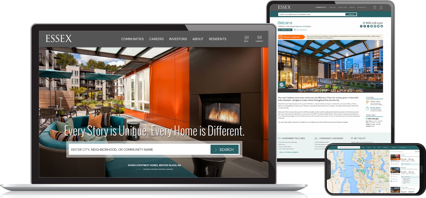
Combining our understanding of the space with user testing, focus groups and customer questionnaires that our client had collected, we offered ideas and solutions throughout the process to improve how listings were searched and displayed. Content was pulled from databases and third-party services like Walk Score and arranged in way that reflected what users wanted. Details such as pairing actual floor plans with specific units, rather than a generic layout of that size apartment, and creating roll overs with a snap shot of amenities, were customer-specific improvements that put the experience above the industry standard.
In addition, we created a module so the internal team could spin off microsites whenever they wanted and they would be integrated with the site. The microsites were built on a template that allowed the client’s marketing team to select a theme and hire a local agency to design a site specifically for that market while maintaining brand consistency.
Putting Properties on a Pedestal
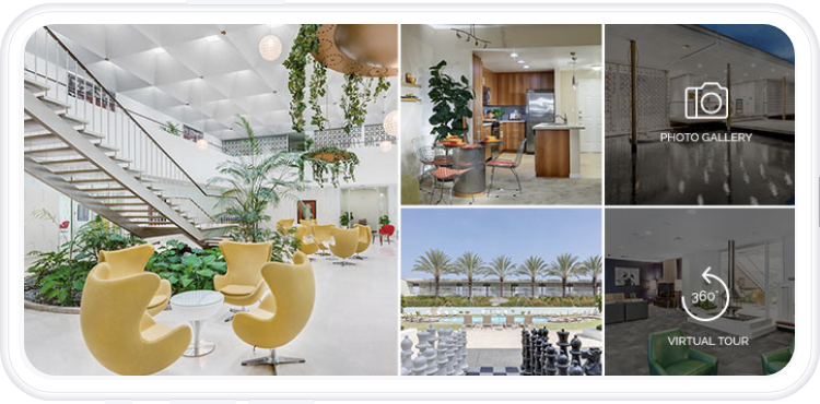
Leading the brand evolution, our design team selected colors from the two brands to create a new brand palette. We knew that users gravitate towards large images and amenities so we took advantage of our long-time client’s high quality properties to elevate the new brand and put the apartment homes on a pedestal. Using iconography, we highlighted amenities and other search criteria important to apartment seekers, supporting the user experience focused on search. We also made the site responsible for mobile use allowing for an intuitive and seamless experience across all devices.
