
What Your Onboarding Button Is Actually Telling Users
Most teams treat onboarding button labels as an afterthought. The dev writes "Register," a designer swaps it for "Sign Up" because it sounds friendlier, and no one revisits it until something in the conversion funnel looks off.
The words on an entry-point button communicate something specific about what the user is about to do. When that word doesn't match expectations, people hesitate. And hesitation at the start of a flow is expensive.
Words Carry Baggage
Riya Jawandhiya breaks this down clearly in his article on Medium. Each of these terms comes loaded with associations that users bring with them before they even click. Think of them as traffic signs. Each one tells users something about the road ahead, and using the wrong one sends them in the wrong direction before the journey starts.
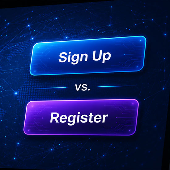
In Jawandhiya's framework, "Register" signals a longer process. Forms, fields, maybe an address or a job title. It's the word on government websites and conference check-ins. If your sign-up is actually just a name and email, "Register" is setting the wrong expectation and likely costing you.
"Sign Up," he argues, is lighter and faster-feeling. It implies a short commitment: name, email, done. It's the right word when you want to communicate low friction.
"Join" implies belonging somewhere. Jawandhiya points to GitHub using "Sign up" while LinkedIn uses "Join now" as a deliberate contrast. LinkedIn is selling you on a professional community, and the word is doing persuasive work before you've filled in a single field.
"Continue," in his view, sidesteps the new-vs-returning question entirely. It works well when you don't want users to have to self-identify before they've even started, removing a cognitive branch point that trips people up more than most teams realize.
"Create" signals personalization, best used when the onboarding experience is meaningfully tailored and the user is building something that's distinctly theirs.
Conversion Data Backs This Up
This isn't just a UX philosophy debate. HubSpot's research on CTA optimization documents a real-world example. The company PartnerStack saw a 111% increase in conversion rate simply by changing its CTA copy from "Book a Demo" to "Get Started."
Nielsen Norman Group's guidance on UX copy sizing reinforces the point. The shorter the copy, the more precisely each word needs to work. A button label has no room for ambiguity.
The "Sign In" / "Sign Up" Trap
One specific thing worth flagging, placing "Sign In" and "Sign Up" next to each other on the same page is a known friction point. The visual similarity is enough to cause users to click the wrong one, especially on mobile. If those two actions need to coexist, differentiate them visually, not just lexically. Some products solve this by leading with "Continue" and routing users based on whether an account already exists, which eliminates the problem entirely.
A Practical Decision Framework
Before defaulting to whatever's in your component library, it's worth asking a few questions:
- How much effort are you actually asking for? If it's genuinely quick, say so with your word choice. "Sign Up" or "Get Started" signals low lift and effort for the user. While "Register" suggests to the user a structured format, which could do well for a professional security minded product.
- Is community or belonging part of the value proposition? If yes, consider the word "Join".
- Do you want to avoid the new-vs-returning distinction? "Continue" handles that cleanly, and it also works well on mobile where users may not immediately remember whether they have an account.
- Are you building something personalized from the start? "Create" can help set that expectation.
Build It Into Your Design System
The bigger issue is that these decisions usually get made ad hoc. Different teams use different words, and the inconsistency adds up to a product voice that feels scattered. If your organization has a design system, this is exactly the kind of micro-decision that belongs in it: not just the visual spec for a button, but documented guidance on which label to use in which context, and why.
That way the decision gets made once, deliberately, rather than re-litigated every time someone spins up a new onboarding flow.